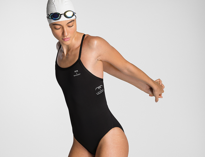
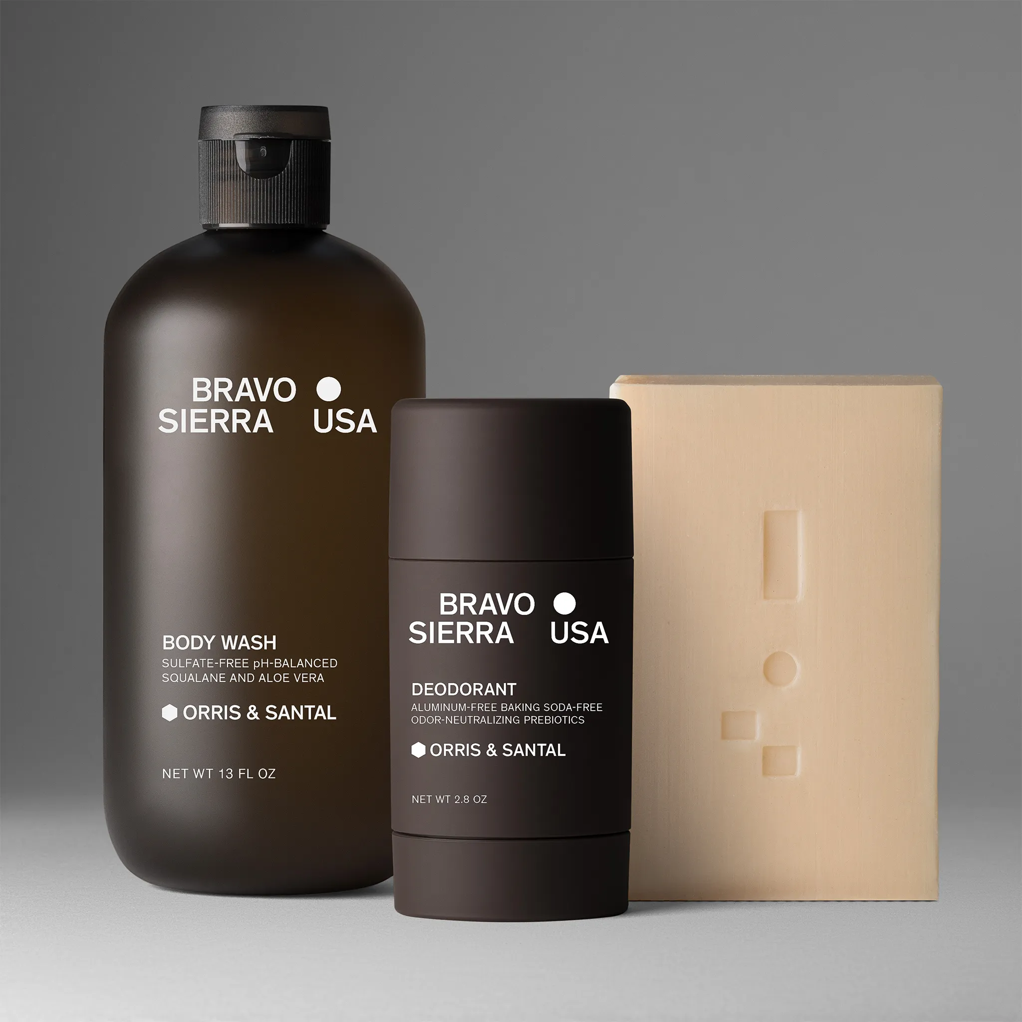
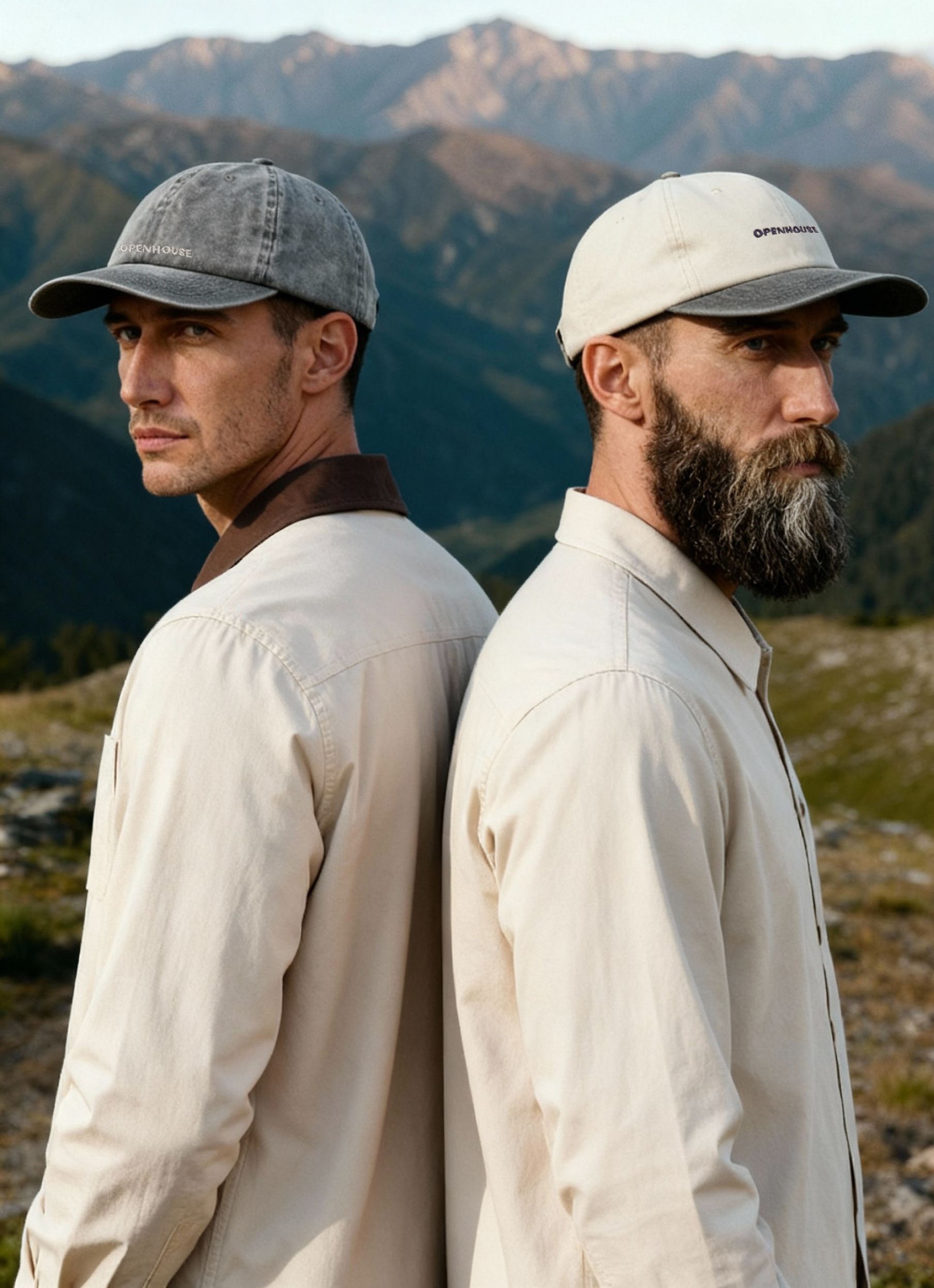
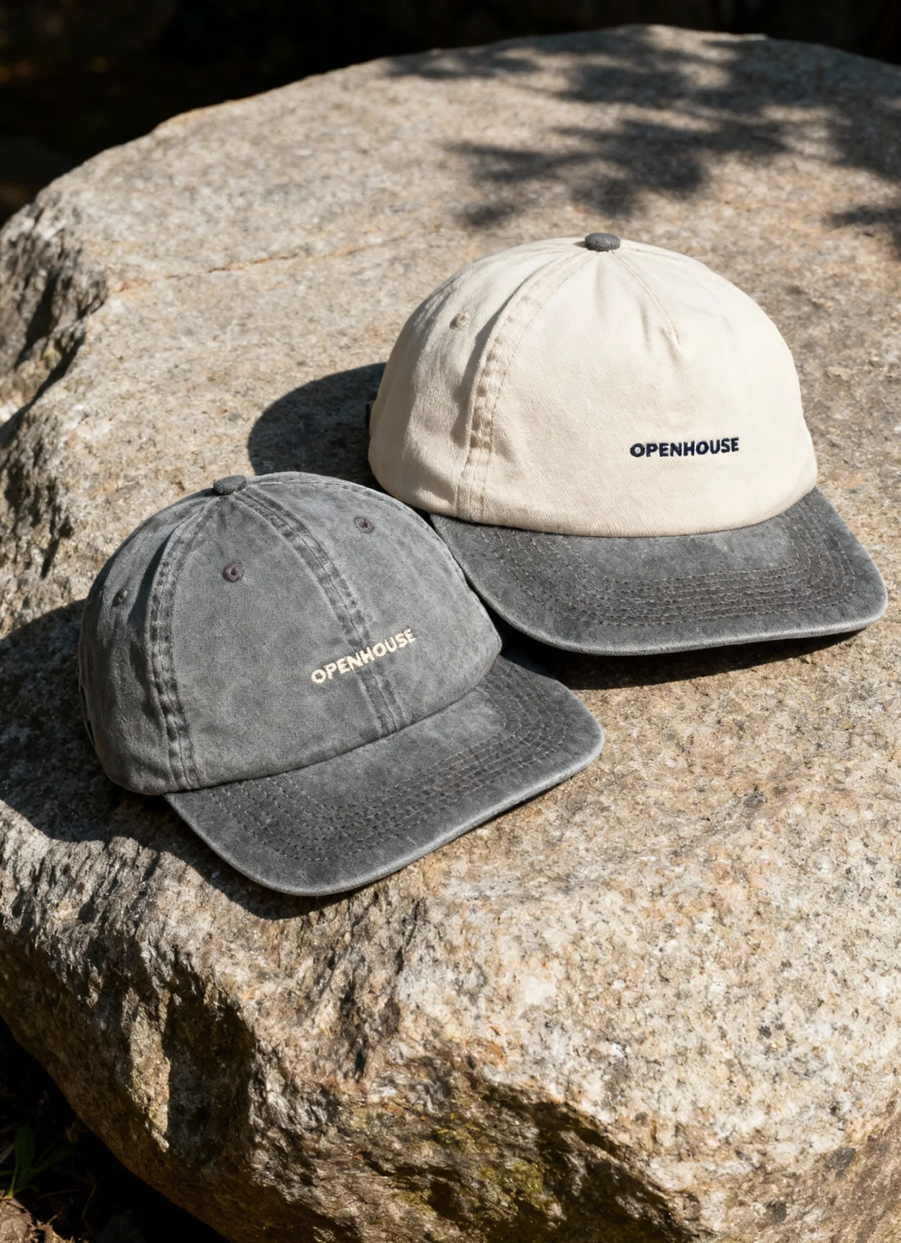
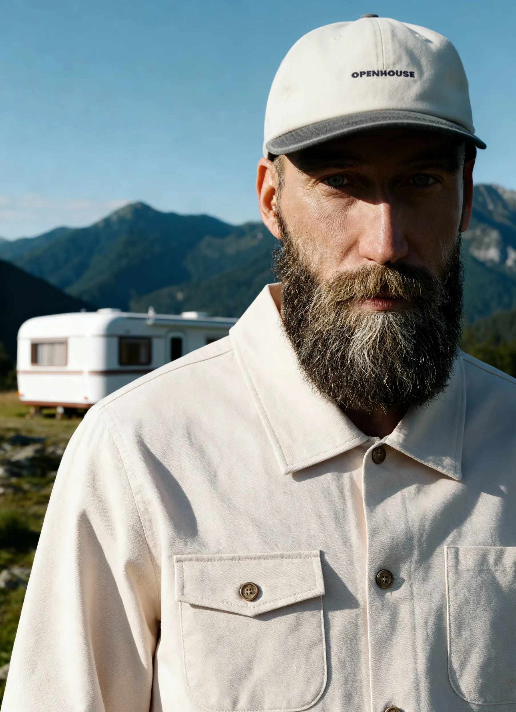
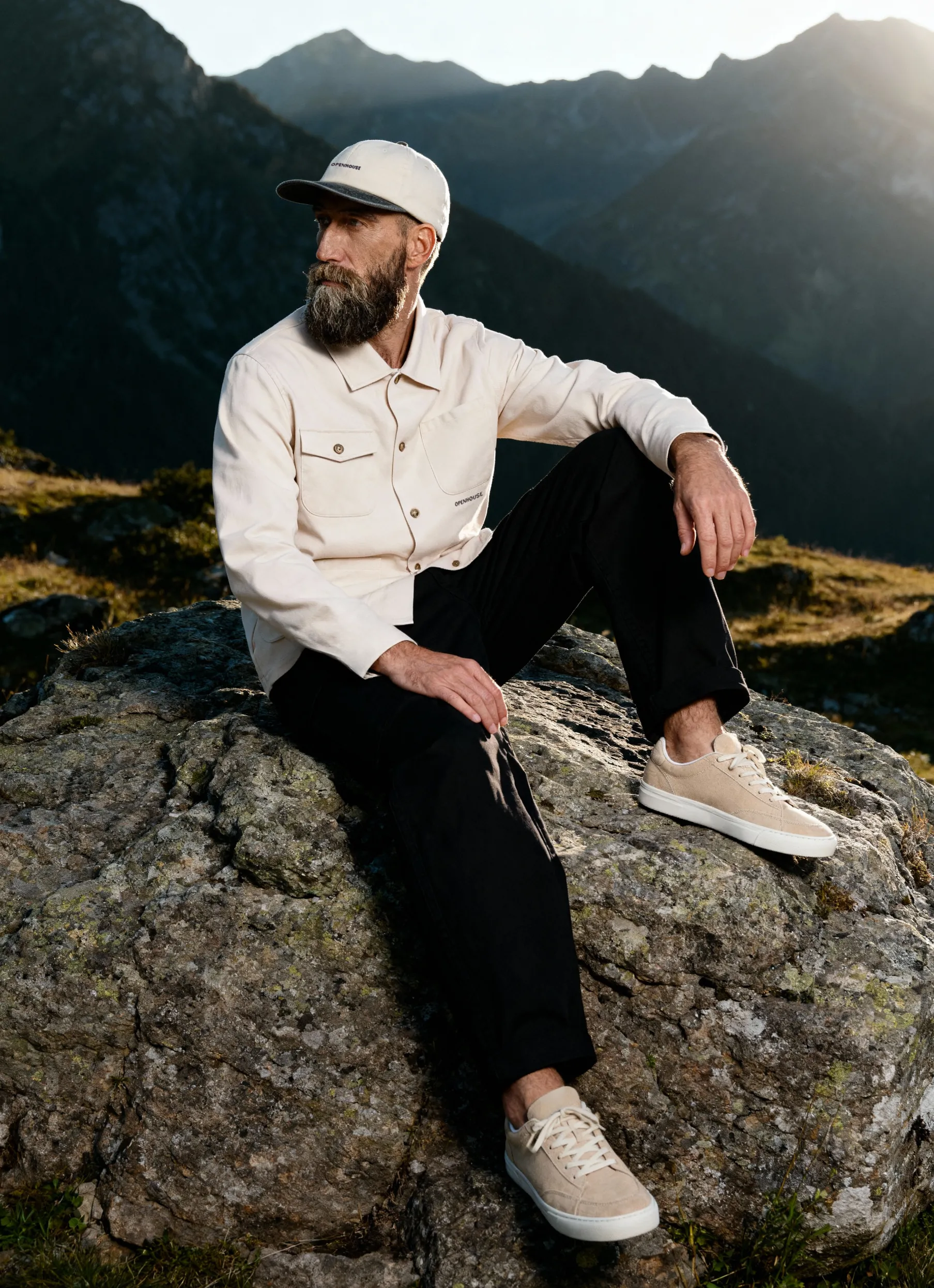
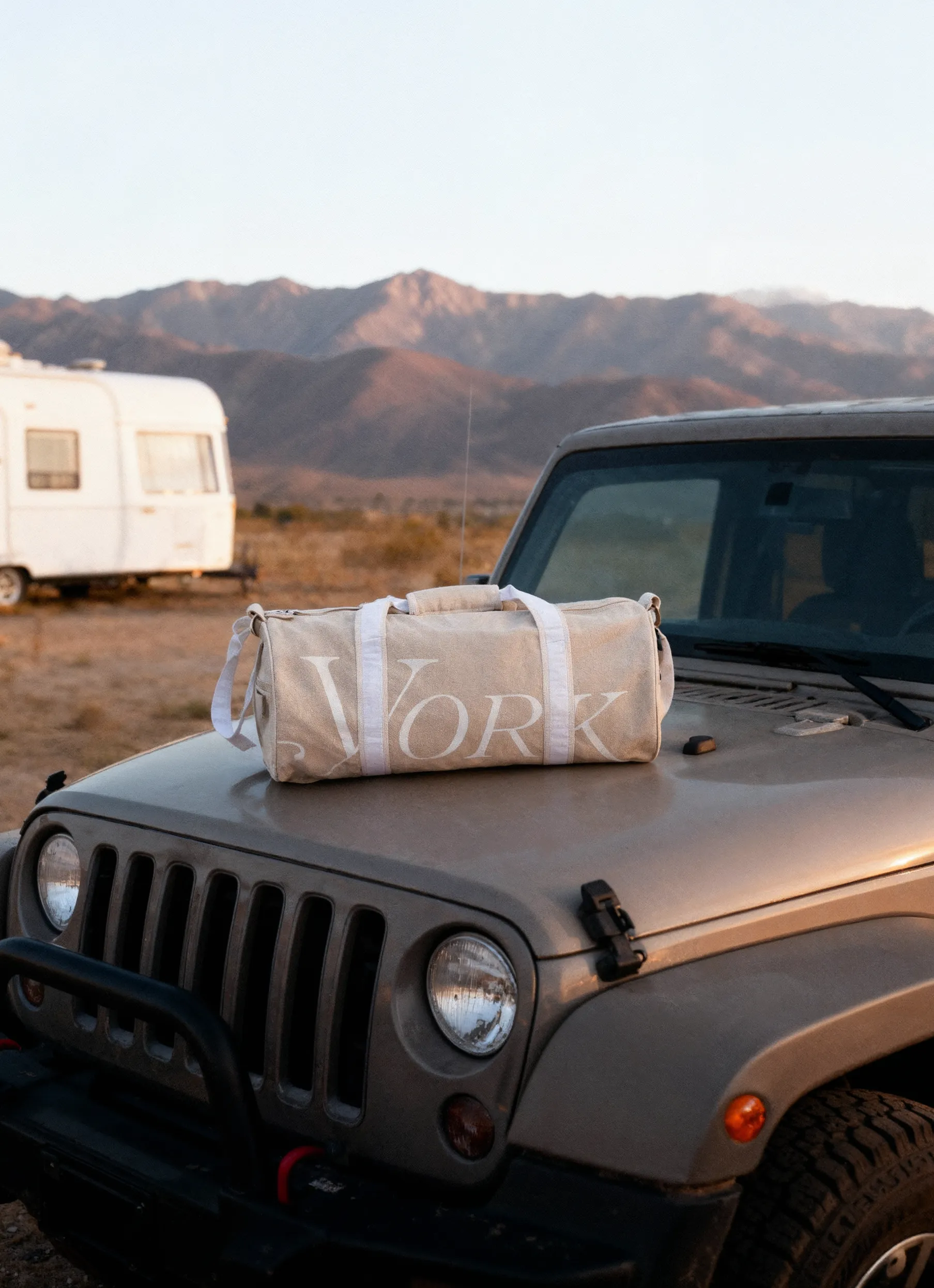
If there is one secret to succeeding in eCommerce with as much competition as 24 million websites, [including behemoths like Amazon], this secret is quality imagery of your products.
As a well-established product photography studio in New York with over a decade of experience in helping your products sell like Los Tacos on Times Square, we have enough insights to share on the topic. Here’s our 2021 guide on how to make beautiful product photography for your website.
In fact, the importance of high-quality professional product images is so high because it’s part of everything that matters in today’s digital marketing:
- SEO
- SEM
- social media promotion
- influencer marketing
- product pages of the website
- affiliate marketing
- email marketing
Every secret has its not-so-secret ingredients though, let's first check out the factors that have a direct impact on the result of a product photoshoot.
The 7 elements of the commercial product photos that sell
There are a few criteria that are critical for a successful photoshoot:
1. Photographer’s experience, skills & talent: the foundation
If you have this one, you have all of them. A product photographer knows every nuance and secret that goes into a selling shot.
Similarly, if you have a champ running a marathon, you don’t need to go into breathing techniques, fueling, recovery, diet, or pace distribution in this case. The champ will have it under the skin, embedded in the winning DNA.
This is why we would like you to meet Keith! He has over 20 years of experience in professional and commercial photography. He has worked in the field in a variety of positions from being a print producer, digital technician to now the lead photographer at Squareshot. He is responsible for the look and feel that has made Squareshot one of the leaders in product photography. His love for photography can be seen in every shot that is produced.
2. Lighting: make-it-or-break-it factor
The next big thing that has a direct correlation to the stunning or not-so-stunning results is the lighting.
When we say lighting, it's more about the whole shebang of lighting equipment, diffusers, reflectors, daylight, positioning, etc.
Yes, it comes right after the photographer’s expertise level. It’s that critical.
.jpeg)
3. Shoot concept & diversity
Your images should be in accord with the channel you are using them for: if they are for social media, glossy magazine, Amazon store, or brand online shop, they will be different.
What angles do you need? Do you need any model shots too? Lifestyle images? Closeups? Colored background or B&W? Props or no props? Mannequin vs lay flat positioning? There are too many questions to answer that will ultimately guarantee a perfect shot fit for the channel and occasion.
4. Preparation of the photoset
Taking product photos for a website is an equation with multiple variables. It's only with proper preparation that your shoot will result in a worthwhile output. If you hire a studio, the ill-prepared shooting day will cost you hundreds of dollars.
Compile a list of all props, equipment, items that you need on the set in advance and make sure it's all shipped on time.
Ensure all rentals are coordinated: studio, equipment, models, team.
5.Equipment: not all is gold that glitters
The quality of the equipment is important but only comes 5th in our list, as, to be honest, even a smartphone can do the job nowadays provided the first 4 clauses are in place.
6. Background: the mood-setter
The background is part of the lighting formula and can add a bit of spice with texture and colors.
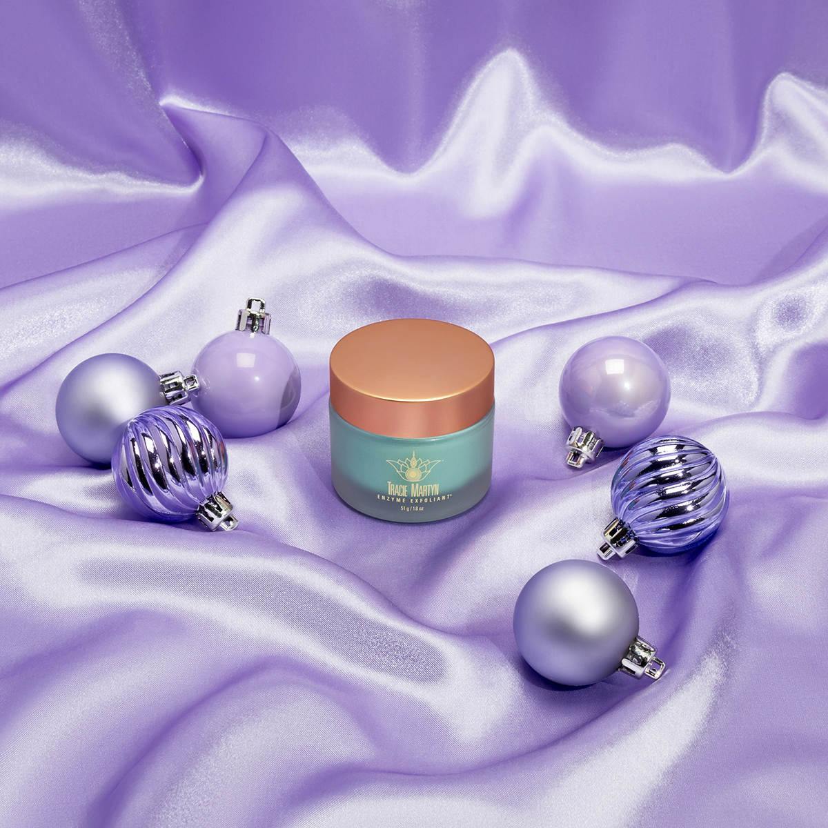
More importantly, a proper background can also save lots of time in the expensive post-shoot editing stage.
7. Post-production & image optimization
The better prepared you are during the shoot, the less post-production is there to handle.
Yet, it’s a vital step that can downgrade any mistakes or imperfections and enhance the captivating powers of the resulting image.

Types of websites that feature product photography
Product images for the website are the norm we don't even notice anymore. Moreover, our standards are so high, that poor photography of high-quality products will deter customers. Let's understand what types of websites there are, that use images of different items as a key part of visual content.
Business website AKA Corporate website

A business website is a corporate website with as few or as many pages as needed. It will usually have these sections:
- About
- History
- Mission & Vision
- Why us
- Catalog
- Team
- Contact page
Many corporate websites will be about B2B business, so they may have a limited number of product shots or a complete catalog, but without the possibility to buy right there. Therefore, they work as the mid part of the conversion funnel to get a B2B client to contact the company’s sales department.
Portfolio website
A portfolio website will usually represent a skillset of one individual, representing the works of an artist or a craftsperson. It can be a portfolio of a sculpture artist, master potter, embroidery master, jeweler, etc.
Such a website may also contain a short bio of the craftsperson, portfolio of works, and channels to contact or purchase from the artist, leading to an Etsy store, for example.
eCommerce Websites
It’s vital to know the channel you are creating images for when making product photos for the website.
Let's see the types of online stores, which dictate the rules of the game.
Marketplaces like eBay, Amazon
If you are setting up your store on one of those big marketplaces, like Amazon or eBay, you have to sing along the common tune.
There are strict regulations on such platforms when it comes to images of products and you have to comply with as much as to be approved.
Size, format, background, resolution, everything matters and should be standardized.
Online stores
The other end of the spectrum is your online store without much competition inside this very domain of other vendors. In this case, you may have an eCommerce store for the entire company, a specific brand, a product, or a seasonal campaign.
Unlike corporate websites, they will have payment features and enable the purchase of an item right there according to your chosen parameters.
Brand stores
The brand store will be a reflection of your brand, which should resonate with your target audience. Such stores may feature a healthy mix of product images and lifestyle shots.
Items can be sorted by product categories and can be filtered by parameters like size, color, type, etc.
Landing pages of a product
A landing page will usually be laser-focused on one product. Such a website will have shots of the same SKU at different angles as well as 360-degree shots and maybe a video of the item too.
Promo website
eCommerce marketing calls for an even more granular representation of a product than a landing page devoted to the product sometimes.
You may have a promotional website that sells one or a few products with a time-limited seasonal offer on it.
Such photography is usually combined with graphic design, which renders the promotional value, underlines urgency, and triggers FOMO.
Product Photography Equipment: the Basics
Product images for an ecommerce website are best made with professional equipment. Can you DIY your way into OK-ish images of your product? Sure, you can! You have to try so much harder though.
This is the standard equipment a pro photographer will ensure to prepare for the commercial photoshoot:
- Camera
Canon and Nikon being the Coca Cola and Pepsi of the photography universe and, quite honestly, there is more correlation between the lighting and image quality than the camera and image quality. That said, the choice of the lens is probably more critical to the quality of the outcome, than the camera itself.
- Tripod
Tripod provides stability and consistency to the series of images – which is quite a common occasion when it comes to making pictures for an online store. You need all products to be positioned on the same level towards the camera and lighting. Holding the camera in your hands only looks cool on the shots of a photographer, while they do prefer to push a button on a fixed gadget.
If you are not sure you are going to devote much time to photography, you don’t need to invest much, a decent tripod selection starts at the $25-30 range on Amazon.
- Background
Background can be as chic or as cheap as you can afford. Many DIY sets produced good results with a white paper or board as a background from a dollar store.
The colored background is rarely used for product pages of the eCommerce stores but is often chosen for social media imagery and other commercial use.
- Table
Nothing fancy is expected here, just a sturdy table, that’s the right height for you. No table is to be seen in the resulting images due to the use of background, so any condition of the table is just fine.
- Lighting equipment
Lighting is one of the most critical pieces of the puzzle when it comes to output. It can make it or break it for the session.
Natural light can be amazing, but there are downsides, that it's moving during the day and is, in general, short-lived and inconsistent. You can't use it for a long session.
Professional lighting equipment is pricey, heavy and a brainer to use. Lighting kits may come as a package when renting a professional studio. All those continuous, Speedlight or monolight lighting kits may come in different shapes and sizes with umbrellas, softboxes, flashes, reflectors, stands, etc.
Even a professional photographer takes time to adjust the lighting to the set and the products, making several shots before reaching a satisfactory test shot. Lighting set up is the combination of experience, technical knowledge, skills, and artistic vision, this is why it has such a high impact.
- Bounce cards or reflecting cards
As you create product images for a website, you may find there are unwanted shadows on the shots. They can be eliminated or softened by the use of bounce cards and reflectors, which are often DIYed from foam boards and hard paper.

- Diffusor
A parchment paper can work as a diffuser when pinned against a window. Any material that allows for the light to come through but dims it can be used to diffuse the light.
- Misc: tape, blu tack, scissors, BBQ sticks
A savvy commercial photographer will know to have bits and bobs like blu tack, double-sided scotch tape, BBQ sticks, binder clips, and cloth pegs for the session. You never know what needs to be propped up or pinned, but it's good to be always ready for those moments.
Camera Settings perfect for website product photography
Product photography for the website will require classical settings when working inside the studio with well-lit unmoving objects. Turn off your flashlights, set your white balance to auto, and ensure you chose the highest available RAW setting. ISO setting on 100 will ensure minimal noise.
Product Positioning: Consistently Creative
When it comes to positioning your product, you have to keep in mind 2 factors: consistency and creativity. They are mutually exclusive and serve different purposes.
Consistency is required so that the visitor sees the series of similarly positioned products that will appeal to the sensation of harmony and esthetics.
Creativity will allow rendering dynamics and breeze life into otherwise inanimate objects. So, once you are done with monotonous shots, do try and position an object or a group of objects in a slightly chaotic or unexpected angle to stir some emotion.
More angles to set objects live
Photography is the key factor that bridges the gap between online shopping and offline one.
The more angles you provide for your eCommerce store visitor to click through, the more details can be scrutinized, the more it feels like real life viewing.
The trick is simple: provide more shots for higher conversion. We recommend a minimum of 4-5 shots per item as the default setting.
Afterthought
When you mission yourself to make product photos for your website, you have to start with a website you really like as a client and try to create something equal or better. If you accept subpar imagery of your products, you automatically accept low conversion, low CTR, low customer loyalty.
If your budget restrictions don't allow you to hire a professional product photo studio, fair enough, make sure to invest lots of time and effort into the learning curve and preparation.
Hiring a pro photo company is often the best option in terms of ROI. Check out our clients’ portfolio to see what we mean, don’t take our word for it.
Product A
SQUARE SHOT


