
Consistent brand imagery can increase revenue by up to 20%. In today’s digital landscape, visual consistency is what makes brands recognizable and trusted. This article shows you how to build a photography style guide that keeps your brand cohesive and impactful in 2025.
You’ll learn what a style guide is, why it matters, its key elements, and how to create one step by step — with examples and expert tips.
What is a Photography Style Guide?
A photography style guide is a blueprint for every photo your brand shares. It outlines visual rules — including lighting, color palette, composition, editing, posing, and wardrobe — so that all imagery feels unmistakably “you”.
Brands with clear guidelines enjoy stronger recognition, faster workflows, and more trust. Think Coca-Cola’s red or Apple’s minimalist shots — instantly identifiable because they never drift off-brand.
Common applications:
- E-commerce — polished, uniform catalogs
- Social media — cohesive feeds and campaigns
- Advertising — aligned visuals across channels
- Teams & partners — clear instructions for freelancers or agencies
Essential Elements
When creating your style guide, define these essentials:
- Color palette & saturation — choose core colors and vibrancy levels to shape emotion and recognition.
- Lighting & shadows — set whether your brand leans bright and airy or moody and dramatic.
- Composition & framing — rules for symmetry, negative space, subject placement, and focal lengths.
Aesop, for example, employs clean symmetry and utilizes a lot of negative space.


- Backgrounds — standardize clean backdrops or contextual settings without distractions.
- Models & diversity — specify demographics, styling, and posing that reflect your values.
- File specs & naming — formats, resolutions, and naming rules for seamless asset management.
- Mobile & AI guidelines — aspect ratios for mobile platforms and standards for AI-generated content.
Step-by-Step Process: How to Create a Photography Style Guide
Define your brand’s visual identity
Audit existing imagery, identify what works, and translate brand values into visual principles.
Set clear objectives
Decide if your guide focuses on product, lifestyle, or campaigns. Define goals like consistency or workflow efficiency.
Document standards
Cover color codes, lighting setups, and camera settings. Use sample images for clarity.
Establish composition & styling rules
Create shot lists, prop guidelines, and model direction aligned with your brand story.
Outline editing & post-production
Standardize retouching, presets, cropping, and approval workflows to ensure consistency.
Specify file management
Detail formats, resolutions, metadata, and storage protocols.
Compile & distribute
Assemble into a clear document, test it on a shoot, refine with feedback, and make it easily accessible.
Pro tip: Partnering with studios like Squareshot ensures your guide is applied consistently, even across high-volume projects.
Keeping Your Guide Relevant
A style guide isn’t “set and forget.” To maintain consistency:
- Train and onboard teams with workshops and easy documentation.
- Use DAM systems, shared presets, and AI tools to streamline adherence.
- Audit content regularly to check compliance and measure performance.
- Adapt to trends like AR/VR or platform changes to stay fresh.
Real-World Examples and Templates
Learning how to create a photography style guide is much easier when you see real-world applications in action. Let’s break down how industry leaders approach their guides, explore a practical template, and highlight common pitfalls to help you avoid missteps.
Case Studies from Leading Brands
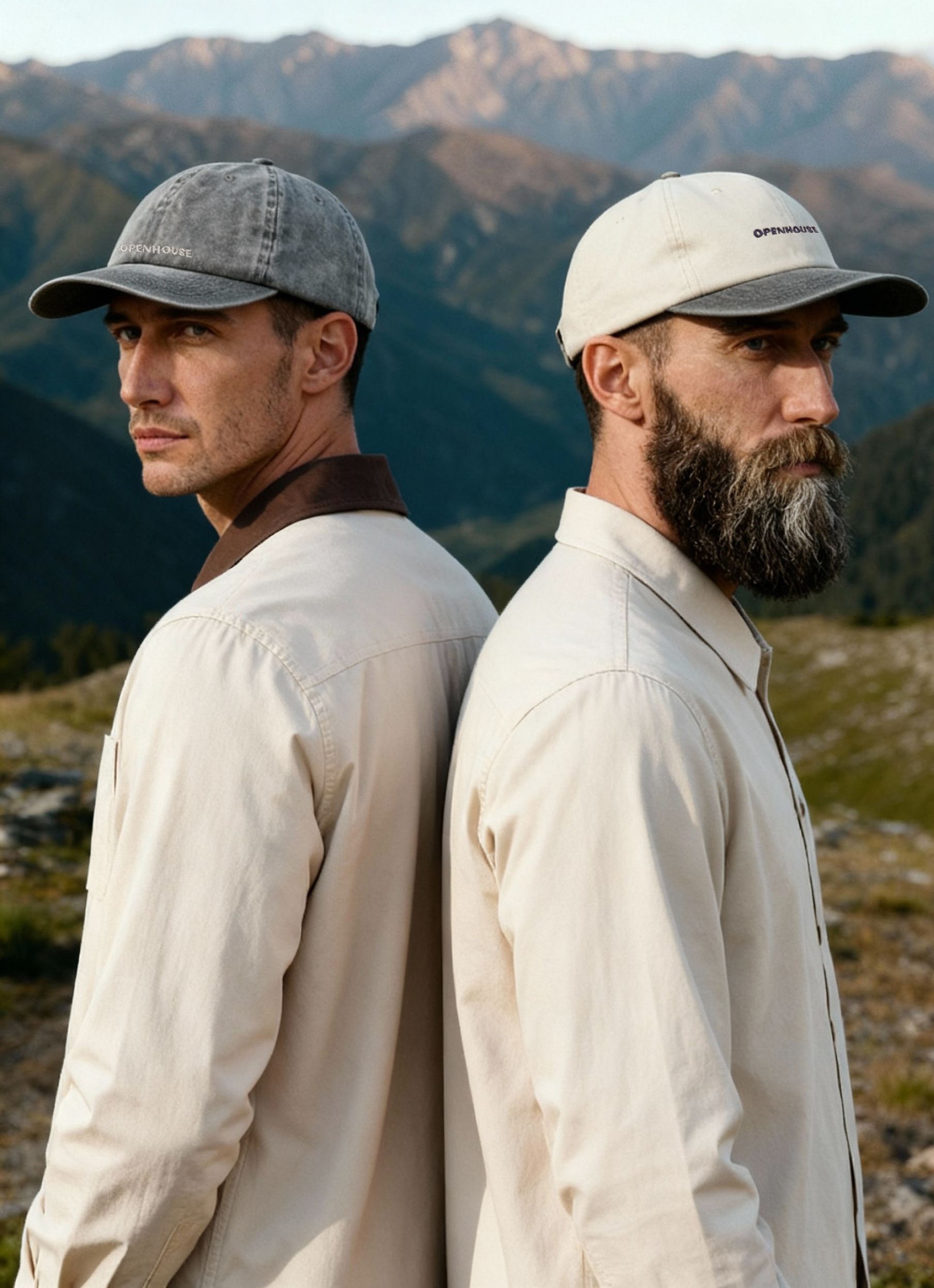
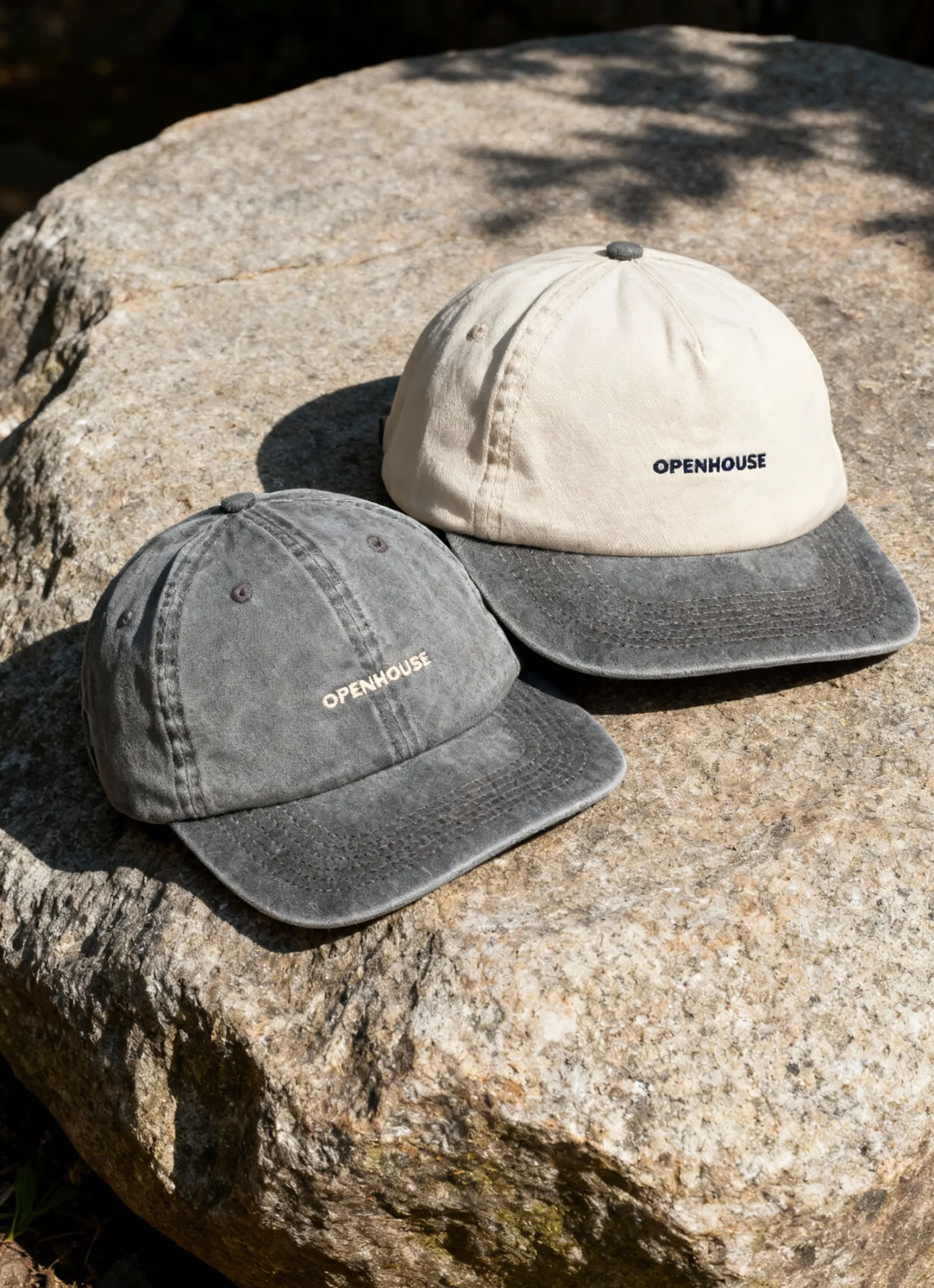
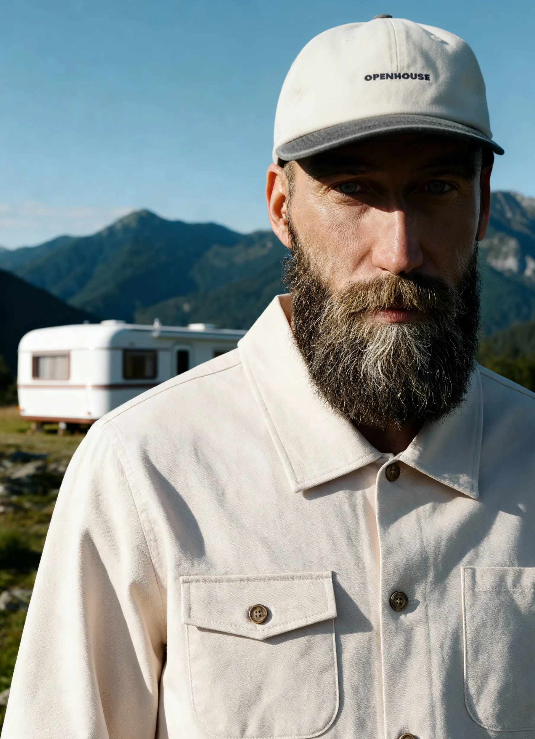
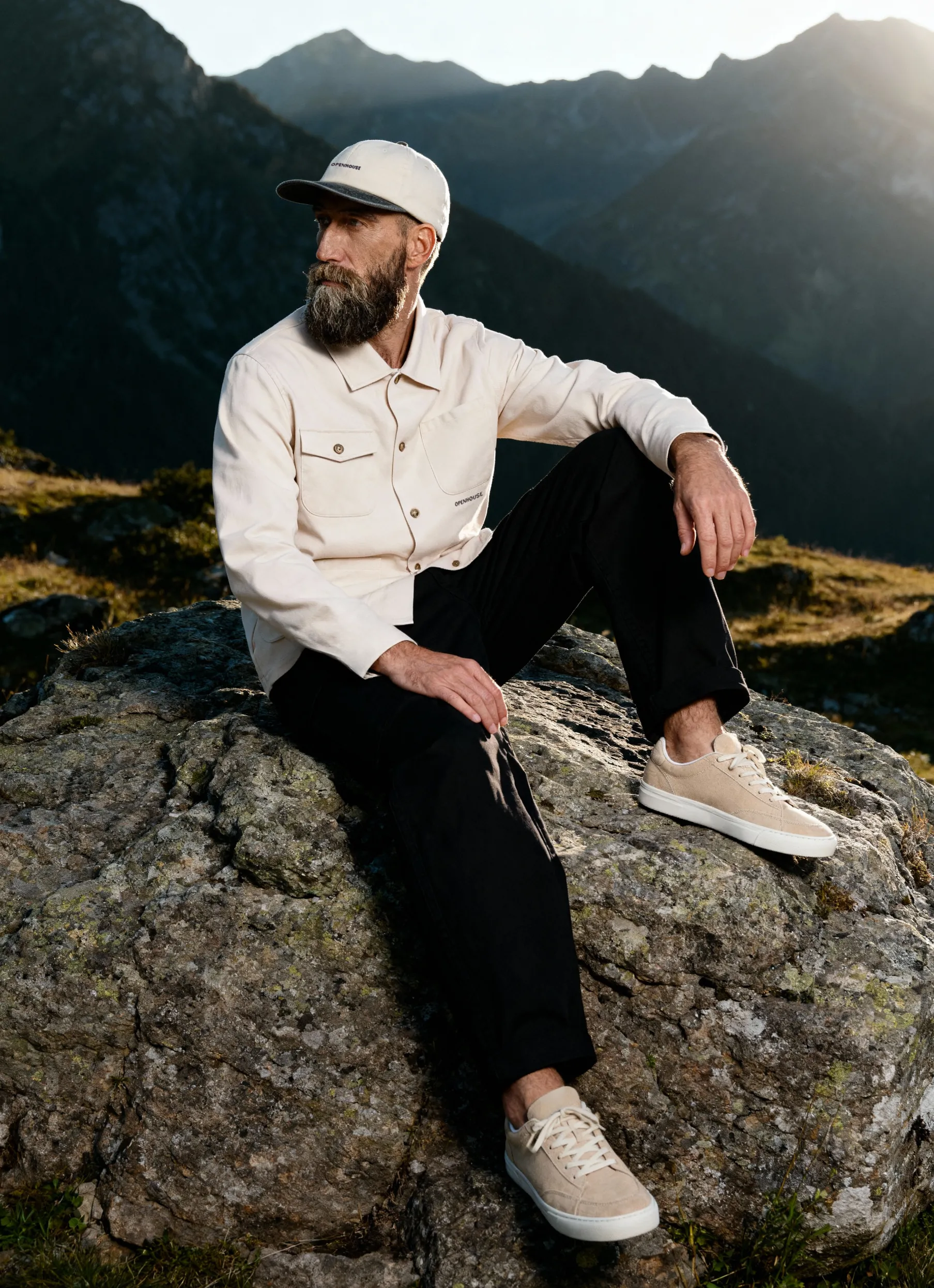
Top brands use their photography style guides as visual blueprints. Patagonia, for example, emphasizes natural light, outdoor settings, and real people in motion. This ensures every image reflects their environmental mission and deep connection to nature.
Glossier takes a different approach, relying on soft lighting, pastel palettes, and close-ups of real skin. This consistency creates an approachable, authentic look that resonates strongly with their community.
Aesop, on the other hand, leans on architectural symmetry, muted tones, and ingredient-inspired props. Their photography feels refined and grounded, reinforcing the brand’s sophistication and focus on natural formulations.

These examples show that a photography style guide is never one-size-fits-all. Each brand tailors its rules to reinforce its unique identity, audience, and values.
Common Pitfalls and How to Avoid Them
Even after you learn how to create a photography style guide, it’s easy to stumble. One mistake is overcomplicating the guide with too many rules, making it hard for teams to follow. Instead, keep instructions actionable and concise.
Another pitfall is inflexibility. While consistency matters, allow room for creativity so your imagery doesn’t feel stale. Finally, enforcement is crucial. Assign accountability and regularly review images for compliance.
Now that you know how a strong photography style guide can shape your brand’s identity and boost consistency across every platform, why not put your new insights into action? Whether you’re just starting out or ready to fine-tune your visual strategy, having a team of experts by your side can make all the difference — especially when it comes to smooth workflows and standout results.
If you’re ready to see how tailored product photography and professional guidance can elevate your brand in 2025, let’s kick things off together.
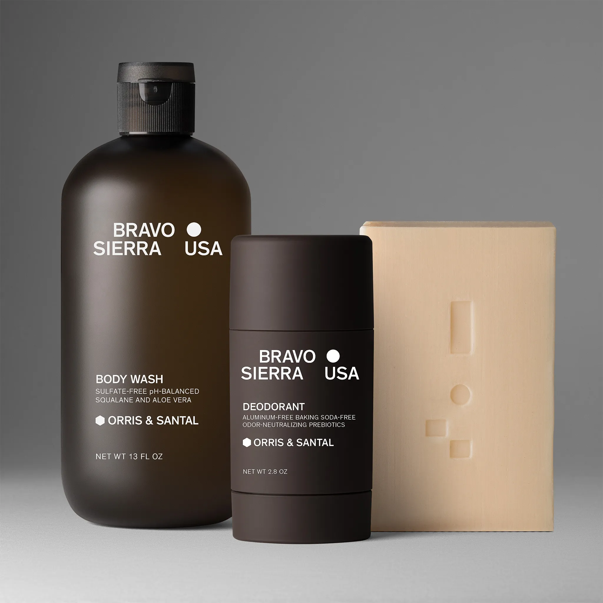
Product A
SQUARE SHOT